


The gap: on contact sheets and hit rates
The strange time when your taste developed faster than your creative skills

The Gap
Something strange happens in creative work. You start off believing your work is great, and think you have a talent to explore. You spend some time going deeper into whatever creative work you are interested in. You explore the genre more deeply, you study the classics, find inspiration from household names. At that stage, you start realizing you didn’t know that much after all.
You land in the gap. While looking for inspiration from great artists, your taste develops faster than your ability to produce creative work. Your work probably got better as well, but your standards increased faster. The gap is the time when your taste is more developed than your creative ability.
The gap describes where I currently feel. It was easier to think of my photography as “good” (whatever that means) before knowing the work of Lee Friedlander, Saul Leiter, Raghu Rai, Jonathan Jasperg, Sabine Weiss… and all the others I wrote about in the past months. I find that, as I got better, the number of photos that I consider good from a day out shooting decreased. My standard for what is a good photo changed, which decreased my hit rate. It’s easy to get frustrated in the gap because it feels like a lot of the photos I take end up in the rejected pile. But it helps to remember that the great photographers I look at for inspiration also have a rejected pile. It’s seems obvious now that I write it. We only see a selection of the photos taken by any photographer.
Contact sheets
The scenario that photographers walk up to a scene and immediately raise their camera to their eyes and take a photo that is great every time is just not true. Famous photographers usually have iconic shots that people will recognize. What’s missing from the story is the process of getting to the iconic shot. The keeper is almost never the first shot in a scene, and often not the last one. There’s an exploratory process of testing out different angles, ideas, and compositions.
The book, Magnum Contact Sheets, reveals the process behind some iconic photos by Magnum photographers. The contact sheets show us, not just the iconic photos, but the rejected ones that were taken at the same scene. There’s some comfort in knowing that great photographers also have average shots. Let's take a look at an example.
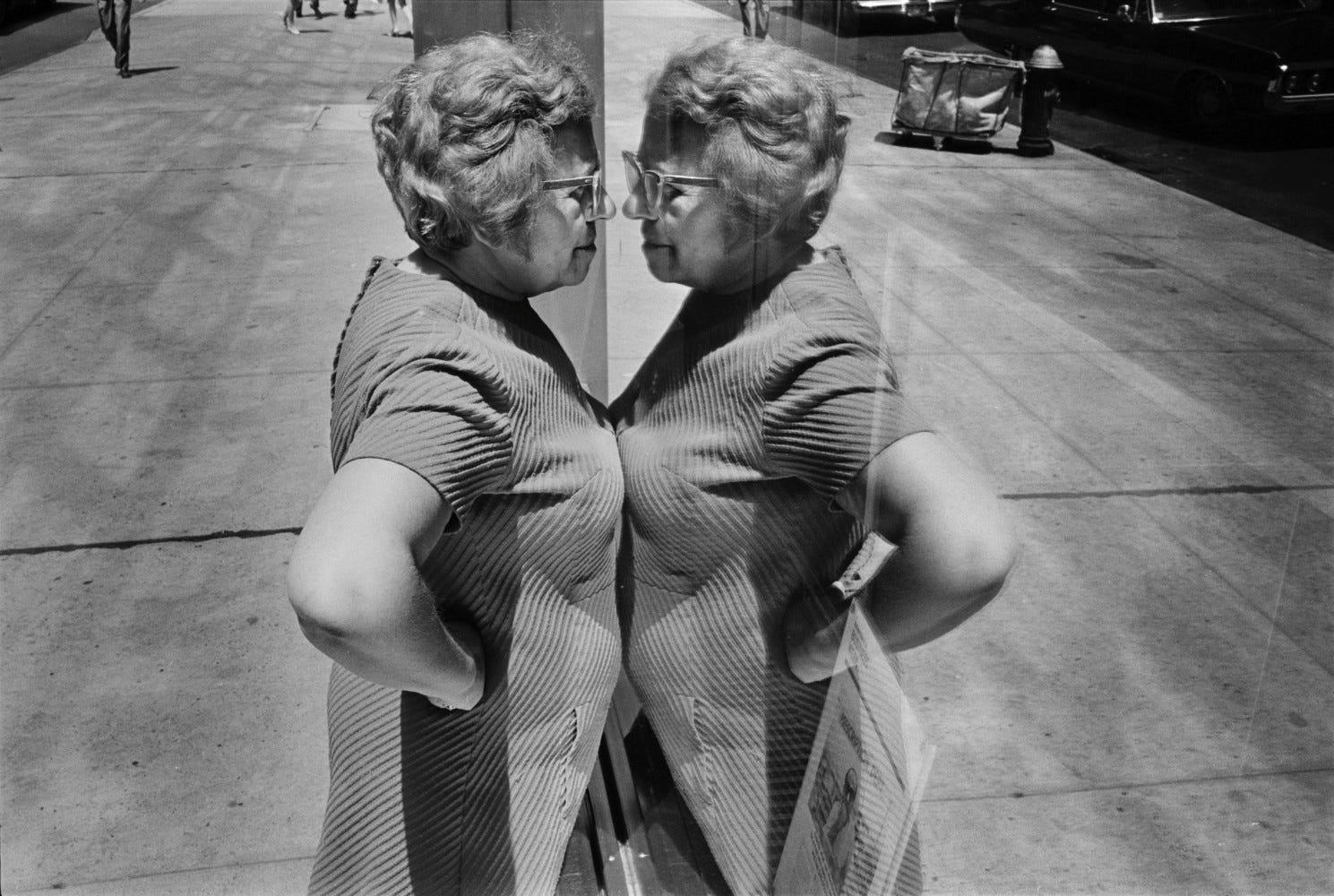
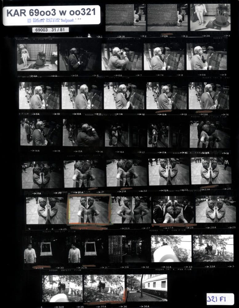
This photo was taken by Richard Kalvar in 1969. In the contact sheet, we can see the other photos that Kalvar didn’t share and ended up in his rejected pile. He explains his thought process in the book:
“As a young photographer, I spent my waking hours exploring my home town of New York. Sometimes you're unconsciously and unintentionally drawn to the same kind of subject all day. This was apparently a ‘store window’ day. As I walked up Madison Avenue, my eye was caught by a man staring intently through a store window on a side street. It was a stockbroker's office and a blown-up view of the New York Stock Exchange ticker tape was projected onto a screen inside, opposite the window. The noonday sun was strong, and the man had to put his face very close to the window in order to block out the reflection of the bright street with his shadow. I sneaked up and started to take a few pictures, but I couldn't really make it work. Frames 7A and 8A were OK, sort of, but ‘sort of’ wasn’t good enough: too many reflections, too much going on inside the window. I tried changing the angle, but then I couldn't see the man's face. But the ridiculous idea of the man looking at himself, touching hands with his double, began to enter my consciousness.
I noticed the people in the background, also looking through the window, and I edged up to the woman. This was much better. The messy street had become less cluttered, and its reflection masked the busy interior. And the woman! What a magnificent specimen. Seeing her press her ample bosom against the window, giving the impression that she was confronting her likeness, made me understand what I was looking for. I wanted to lose all connection with the context, with stock market results and streets and other people, and isolate this woman shamelessly staring at and touching a stranger who was in fact herself. And then bang! My persistence was rewarded when everything came together in frame 25A. I took a few more pictures, but they were mere aftershocks to the big earthquake. If I had wanted a funny little photograph of people looking through a window, frame 27A would have fit the bill. But what has always excited me in photography is to step out of ‘real’ reality and enter a world of frozen dreams, abstracted from the ordinary. The merely amusing is a temptation I struggle to avoid.”
My contact sheet
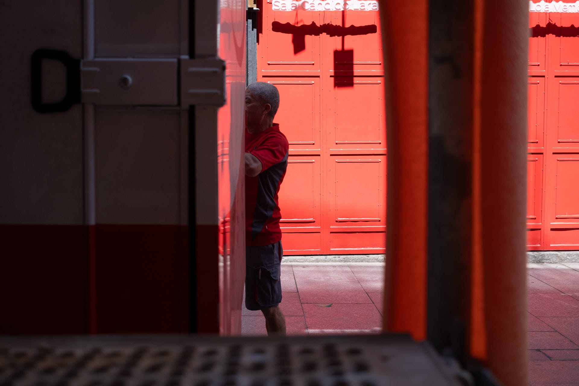
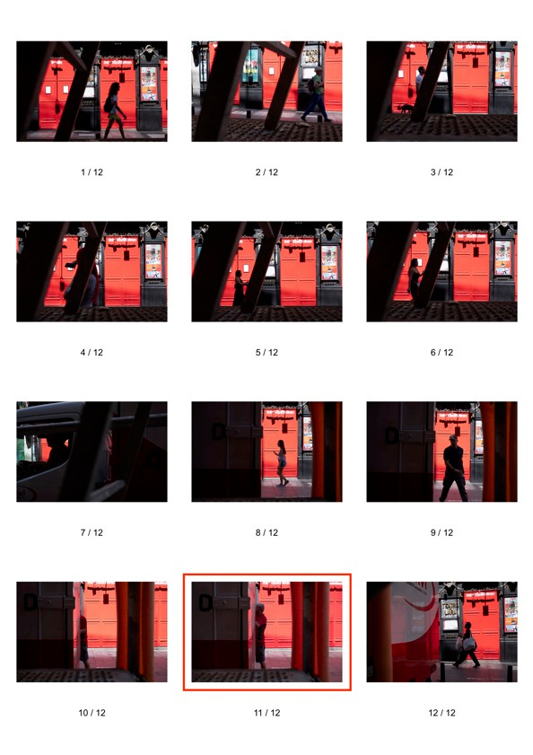
The example above is a good example of what happens when working a scene. Initially, the bright red doors are what grabbed my attention. There was some scaffolding on the other side of the street that I thought I could use to frame some people passing by. A few minutes later, a truck, that was partly red, parked right in front of me. A few seconds after that, a gentlemen, also wearing red, came around to unload something from the truck.
I didn’t magically press the shutter the exact moment all these things came together, but took a series of images that led up to this moment.
The question I was wondering about: am I a better photographer if I am able to increase my hit rate? I took 12 photos to get to that one that I would share. Could I have done it with just one? Or three? I think the number of frames I took to get there is irrelevant. What matters is the successful images. The number of frames it took to get there doesn’t change the output. In normal circumstances, the viewer would not know anyway. Ultimately photography is as much about taking the shots as it is about curating them, and deciding what to show and what to discard.
Thanks for reading!
Brilliant post!