


Cinematic photography: on color and emotions
Recreating cinematic looks from The Joker and Amelie in photography

Apparently colors are important in visual arts. I knew this intuitively of course but never thought about how it’s used intentionally. Recently, I discovered how filmmakers use color to help tell their stories and I thought I would try to apply cinematic editing to my own photos.
Color has been used in cinema for a long time. Even before the current color technology, filmmakers would hand paint their film frame by frame to add color. Colors were associated with fantasy films and used as a sort of escape from reality. Vibrant colors emphasized a departure from everyday life, which was shown in the news and documentaries in black and white. As if our real lives were black and white.
Colors were also used as a storytelling tool. Early on, artists realized the emotional impact colors can have on viewers. In the 1924 film, Greed, director Erich von Stroheim hand painted film frames to give them a gold tint. The movie follows John McTeague and his wife after winning the lottery. The film is mostly black and white, but some scenes have some gold. At the end of the movie, the whole scene is tinted gold to symbolize the character’s fall into greed.


Colors are used for their emotional response. By using certain colors and tints, you can create different moods visually. I don’t normally notice color grading when I’m watching a movie. In my mind, all movies just had a “natural” look that aims to reproduce what we see with our eyes accurately. But I was just not paying attention.
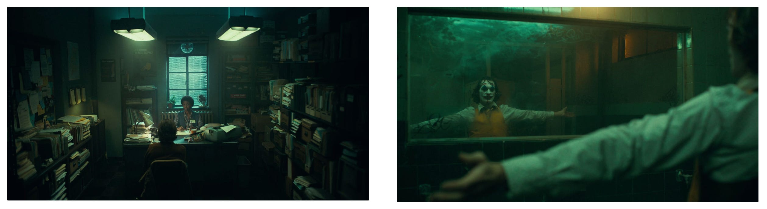
The first movie where I noticed the colors was The Joker. The green tint throughout the movie was too obvious for me to miss this time. I’ve been looking at stills from movies this week and finally realize that a lot of them actually have very stylized colors. It’s more noticeable when looking at stills. For some reason, while watching the movie, it all seems smooth and meshes together seamlessly.
Most of my photography is in color but I wouldn’t say that I pay much attention to how different colors come together or how they influence photos. I thought it would be a good idea to recreate the colors of famous movies in my own photography.
The Joker
Muted colors, a greenish tint, and high contrast created the dark mysterious look of The Joker. It evokes an eerie feeling that works well with the movie’s plot. I looked for photos of mine that could match the mood of the movie and got to work in Lightroom. I think the result is quite close.


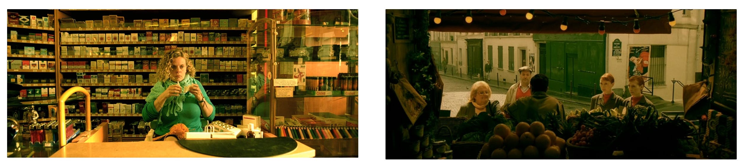
Amelie
Amelie has a warmer, nostalgic feel to it. There’s almost always a complementary color scheme with red and green in every scene: red clothes, a red book, or even red and green peppers. I found this one a bit more difficult to reproduce compared to The Joker and the match is not as accurate.


I discovered many color editing tools while doing this and learned a lot about how colors can evoke different emotions. I don’t think I would choose any of those cinematic edits for my own final photo but they are fun to try. Somehow, in the context of a movie, the colors seem to flow naturally but on individual photos, they seem overdone.
That’s it for this week. Thanks for reading!
What color tools did you discover and try…
The psychology of color for logos.